Design Once. Build Twice.
A creative production studio's site, rebuilt with AI from design through to a custom WordPress CMS. Four failed attempts with an AI site builder, then the six-step sequence that produced 42 pages from one content file and two builds matching element for element.
A creative production studio came to me with a website that did none of its work justice. Nine years of video, audio, editorial and photography, represented by a template with a logo dropped on it.
This is the whole rebuild: what failed first, the sequence that worked, and what shipped. The client is anonymized and their details are available on request.
Four tries at "build me a website"
The first attempt went through an AI site builder. Four separate runs, four different sites, nothing worth keeping. Roughly two hours, zero yield.
The tool was not bad at building websites. "Build me a website" leaves a thousand decisions open, so it made every one of them, differently each run. Someone else's template kept bleeding through: wrong name, wrong city, invented statistics, testimonials from a company that does not exist. Changing one brand colour meant hunting down 145 separate uses of it, because the colour had never been a decision. It was an occurrence.
An AI site builder is fine for getting a website. It is not fine for getting a specific website. Template contamination is a floor you cannot prompt your way under.
The sequence that worked
Six steps. The second one decides the outcome and it is the one almost everybody skips.
1. Ask for directions, not a website
Home page only, two layout options at a time, because you are going to react to them and reacting to twelve things is not reacting.
Answer the tool's questions concretely. What is the site for. Multi-page or single. Exactly what name goes on it. Tone in two words, where "confident and direct" is useful and "modern and clean" is not. Hero treatment. Whether the numbers live in a stats band or inside the sections.
Then react by name. "I like the five-track timeline, not the rest of this one" moves you forward. "Make it pop" does not. Three rounds and seven distinct directions before one was clearly right.
Check before continuing: can you name the typefaces, the palette, the grid and the spacing scale? If not, you have a picture you like, not a direction.
2. Design every page before any code exists
Not the home page. All of them.
Give a coding tool a finished home page and a blank canvas for the rest and it re-interprets the style on every page. Spacing drifts, card patterns change, heading scales wander. By page five it is a different website, and you will not notice, because each page looks fine on its own.
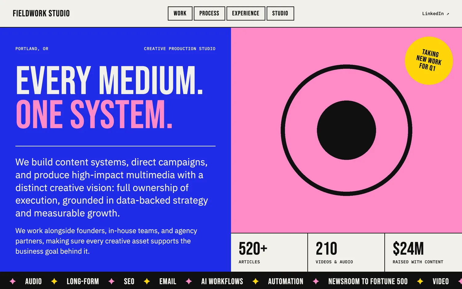
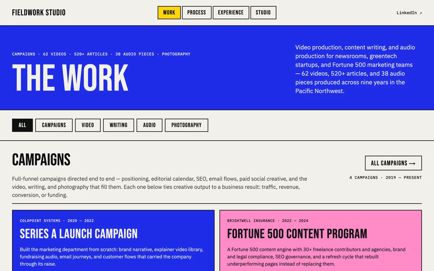
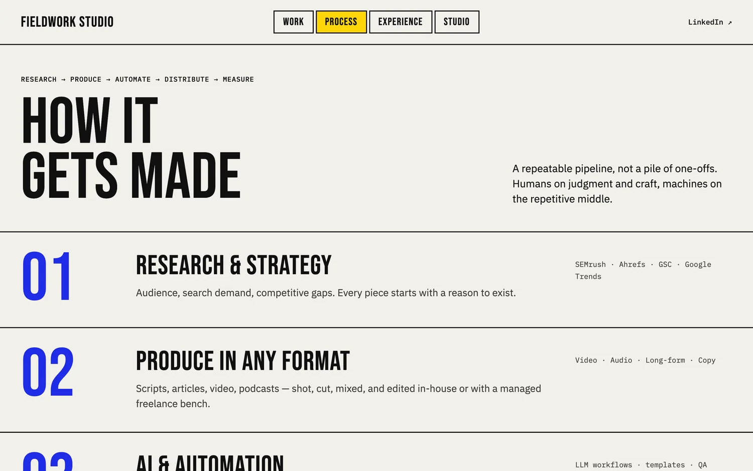
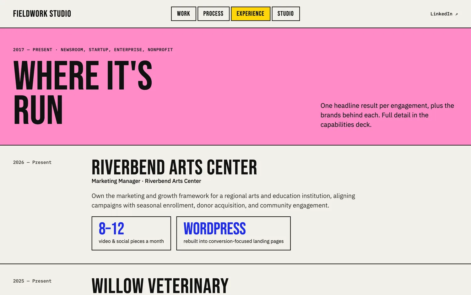
Require real copy, not placeholder text. Placeholder hides length problems that only appear when the real sentence runs 40% longer than the fake one.
Check before continuing: put the pages side by side. Is the heading scale identical? Did page four invent a new card? Fix it here. Fixing it after the build costs many times more.
3. Hand the build two artifacts, not a conversation
A written spec: design tokens, page-by-page layout, interaction behaviour, responsive breakpoints, SEO requirements.
A content file: every word, number, link and image reference, structured, in one place. A single 38KB content.json held all of it. The static site renders from it and the CMS imports from it, so neither owns the copy and the two cannot disagree. A correction happens once instead of four times.
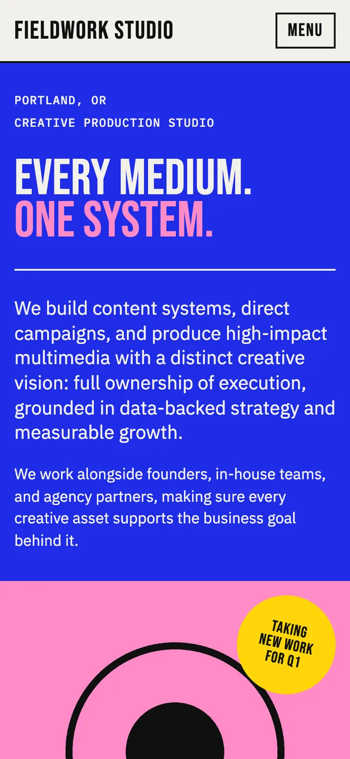
4. Build static first and review on a real URL
Plain pages first, on the real domain in a subfolder, with a noindex tag so nothing gets picked up while you look. Review on real pages with real content, on a phone and a laptop, clicking everything.
5. Write the check before you ship
A script walks every built page and flags a title over roughly 60 characters, a meta description outside 70 to 160, anything other than exactly one H1, any image with no alt text, any title or description duplicated across two pages, and any page missing from the sitemap.
$ python3 src/media.py
34 images

$ node src/build.mjs
Built 42 pages

$ node scripts/seo-audit.mjs
41 pages checked
  No problems found.
By hand across 41 pages that is a day nobody has, which is exactly why this work never used to get done. It costs almost nothing now. Run it on every build.
6. Convert to a CMS last, and lock the design
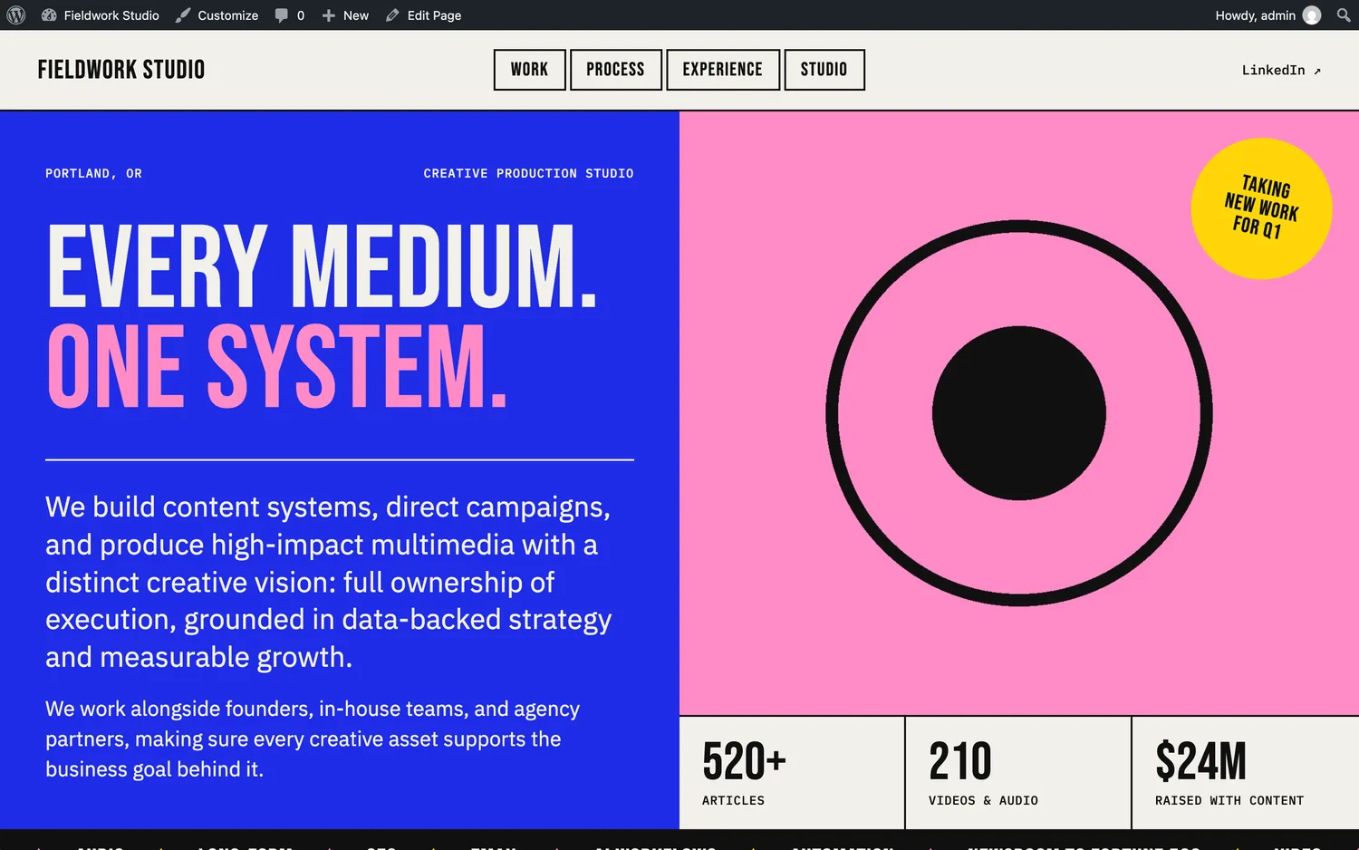
Three rules carried it.
Same stylesheet, same markup, same URLs. If the CMS version gets its own styles the two drift apart within a month. Keeping URLs identical meant nothing broke at the switch.
Content types that mirror the site, not a flat page list. The owner edits work items, campaigns, clients and roles.
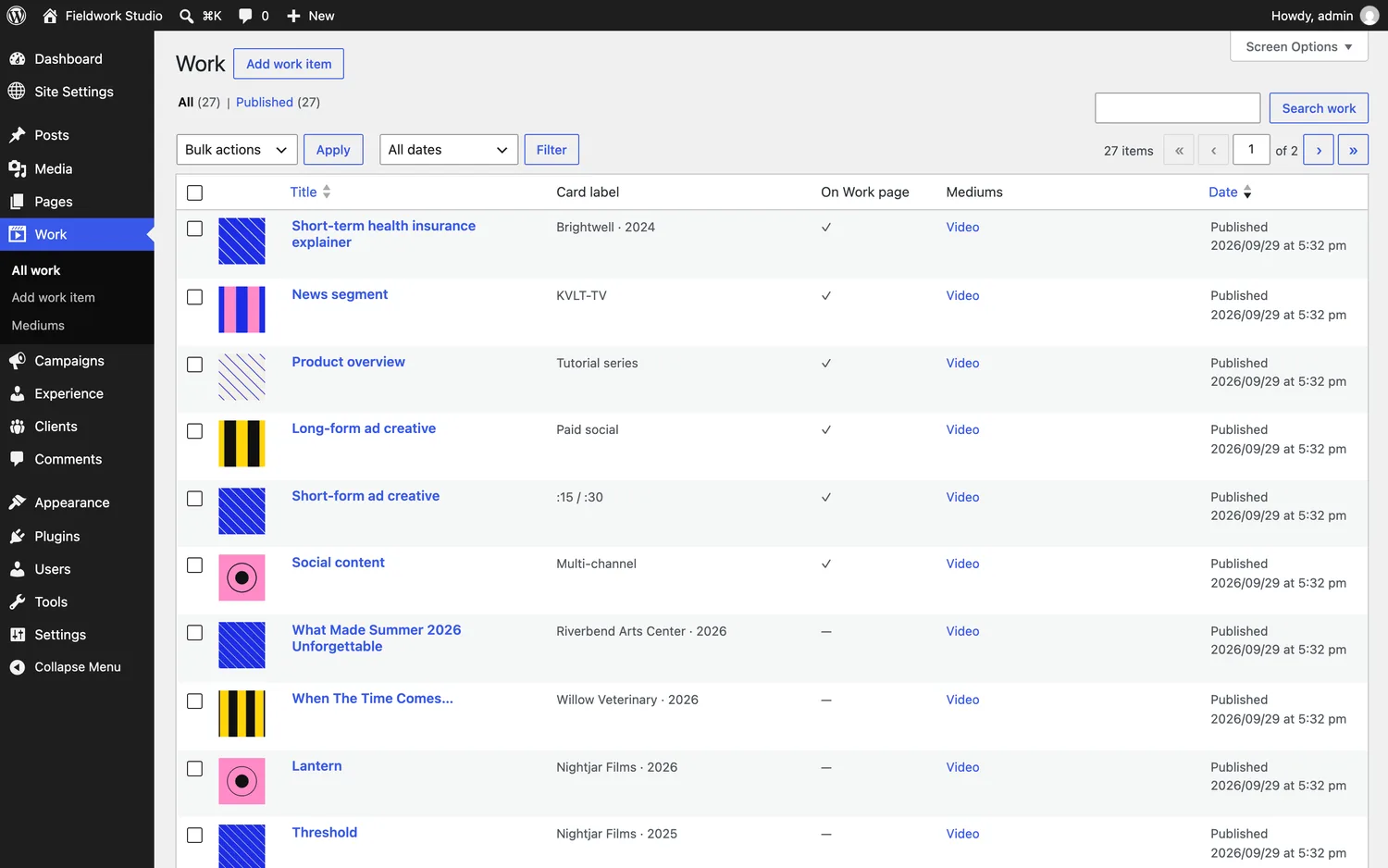
Lock the design vocabulary. Five colours declared and the custom colour picker turned off. Arbitrary type sizes, weights, line height, letter spacing, borders, shadows and layout editing all off. Character counts on the fields that have a length the design was built for.
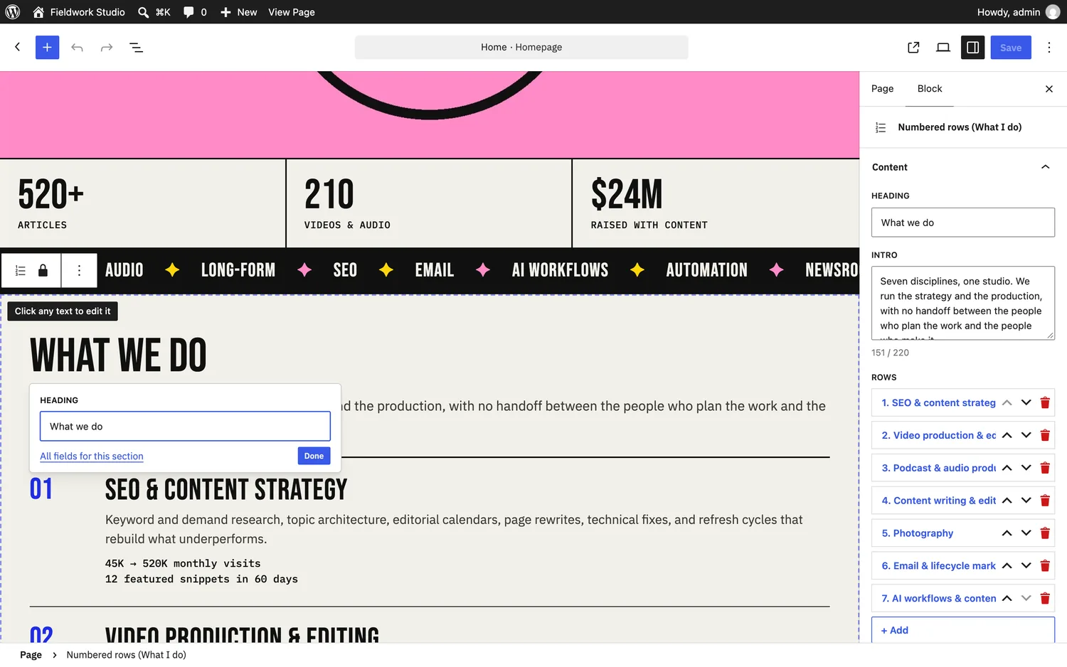
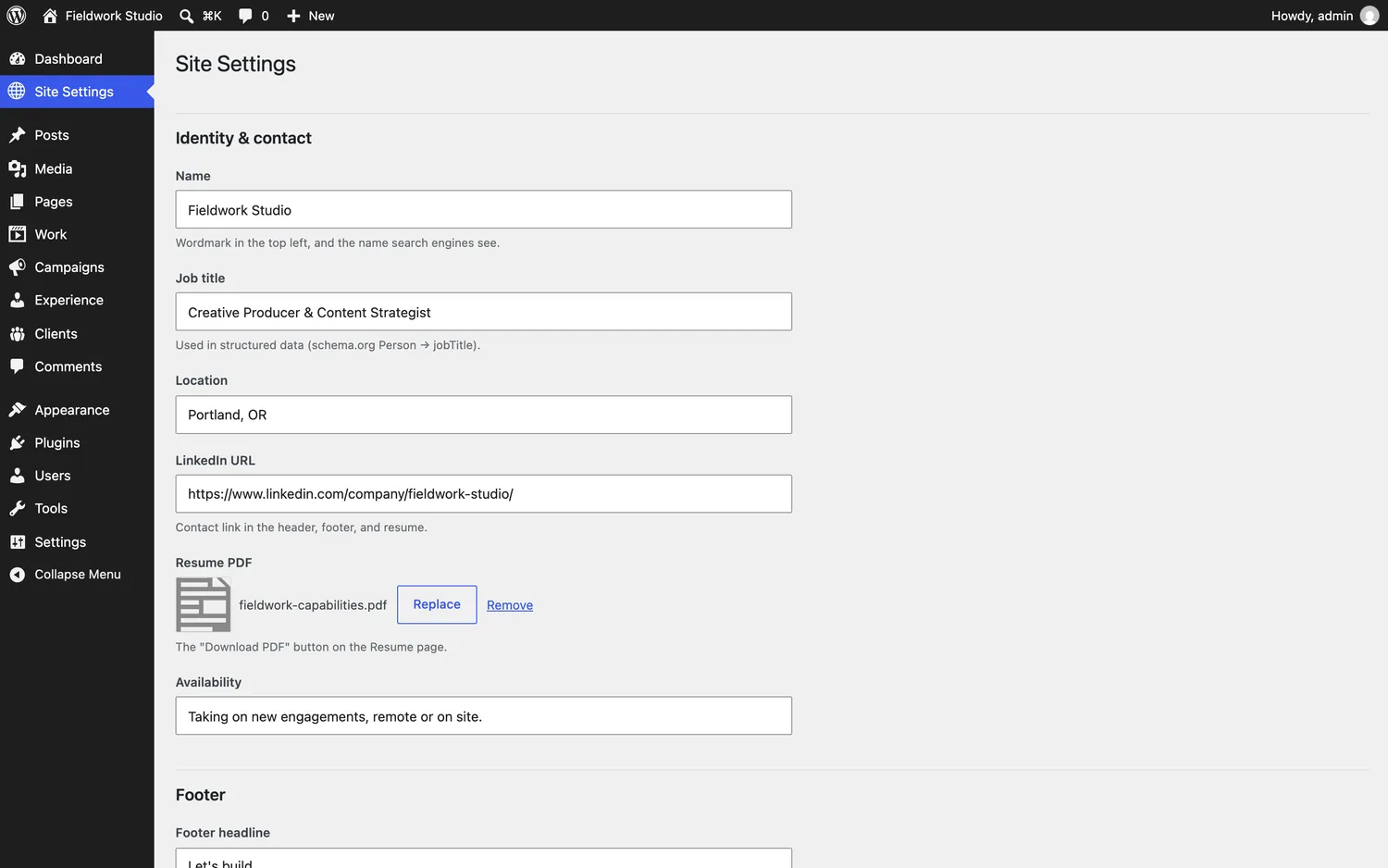
So the owner can change every word on the site and nothing can come out off-design. Structured data, verification codes and a site-wide review-mode switch all sit on one settings screen as plain labelled fields.
What shipped
| Thing | Count |
|---|---|
| Pages built | 42, of which 41 are indexable |
| Pages passing the SEO audit | 41, clean |
| Work items, campaigns, clients, roles | 27 / 4 / 17 / 7 |
| Media files, images with responsive variants | 55 / 34 |
| Editable design sections | 14 |
| Custom post types plus taxonomy | 4 + 1 |
Two separate builds of the same site, static and WordPress, matching each other element for element. Not because anyone was careful at the end, but because by then there was nothing left to get wrong.
These are build figures, not performance figures. The site went live five days before this was written, so there is no traffic, ranking or conversion data yet and nothing here claims any. This is a case study about how the thing was made.
The symptoms, and what each one means
If you are mid-build and something feels wrong, this is the fastest diagnostic I know.
| Symptom | Cause |
|---|---|
| Pages stop matching around page four or five | You did not design them all before building |
| The same copy is wrong in three places | No single content file |
| Changing one brand colour means dozens of edits | The colour was never a token, just an occurrence |
| Someone else's template keeps showing through | You asked for a website instead of a direction |
| One field edit breaks the layout | Free-form design controls were left on |
| Nobody caught the missing alt text until launch | No check in the build |
The part worth keeping
The building is fast. The deciding is the work, and it decides whether you get a real site or a generic one.
These tools are not bad at design. They are bad at deciding on your behalf, over and over, in ways you do not notice until page five. Move every decision to the front and what is left is translation, which they do extremely well.
If you are mid-build and want a second read on it, that is a conversation I am glad to have.
Client anonymized at their request. The studio name, client names, logos, imagery and result figures shown are stand-ins. The design system, theme, editor, content model and every build and audit figure are from the real engagement. Real details available on request.
Growth notes, occasionally.
What I'm seeing in the numbers across engagements — sent when there's something worth saying, not on a schedule. Reply to unsubscribe; no sequence, no spam.